I my starting idea thumbnail sketches I detailed an idea in which I create an origami like face which is inspired by the lyrics f the song. I have started experimenting with creating an image based around this idea.

I found a photograph which had a strong sculpted look to give structure to the graphic. I then used the pen tool in illustrator and a certain amount of dead reckoning to separate the image into the different shaded areas.

I them split these areas into triangles and other angular shapes. Depending on the size of the area that was being filled the size of the fragments varied to try and achieve a sense of depth and shape.


Once I had the general shape of the graphic I started to play around with layering it but I still felt it needed more detail.
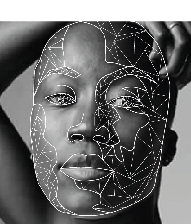
So I added fragments in the eyes.

I also played around with different backgrounds and negative space. which I felt was really effective but not very inventive.

Layering them had quite a good aesthetic effect and works on a conceptual level because it conveys an added depth of meaning through the way the eye has to look longer to figure out exactly what is going on.

I like this one less but still it could be worth further examination.

after playing around with this graphic i noticed that the central panel of the face looked as if it were sinking into water in quite a sinister way. so I looked at removing the rest and maintaining the negative space effect to enhance this appearance. I really like this and could even look at photographing an oily substance of some kind and making it look as if the face is sinking into it. this would really achieve the darkly appealing aesthetic that I identified earlier in this brief.

I also noticed that the upper protuberance in the graphic left by removing the rest of the face could be turned into a face in profile. i love this because not only does it play with perspective in the same way that the Massive Attack song does but also because I can continue this idea in other areas of the face so there are multiple faces within faces, the more you look the more you see, which fits perfectly With Karmacoma.
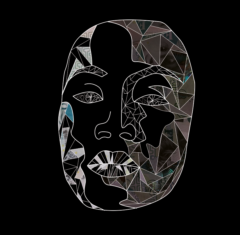
I also went on to look at the completed face graphic and placing fragments of money into it. I have also added slight brightness adjustment layers to create a sense of shape and depth because when both sides of the face were the same colour the graphic got lost. I feel that perhaps this is too complex and confuses the eye. Possibly I could combat this by making the image just the photographic fragments, either way there is still milage in this idea.
No comments:
Post a Comment